![]() The logo is a sphere, a conceptual globe, with arrows wrapping around the sphere, showing a change. SolidSolut
The logo is a sphere, a conceptual globe, with arrows wrapping around the sphere, showing a change. SolidSolut
Location:
Logo design Wichita, KS
Style:
Conceptual logo design
Industry:
Environmental logo design
![]() The logo design for Richard Lynn Shoe Market is designed to communicat
The logo design for Richard Lynn Shoe Market is designed to communicat
Location:
Logo design Wichita KS
Style:
Conceptual logo design
Industry:
Retail consumer logo design

A modern logo design could be almost anything but in the big picture a modern logo is simple and usually literal but heavily stylized with a new typographic feel. The shapes are easy to draw on a computer and consist of geometric shapes cleverly assembled.The GoJoe's logo design is a steaming cup of coffee held by cupped hands. Hands that seem to hold the cup of coffee with great care and concern as if GoJoe's coffee is special and ready to go. The steam is made of dots that are extrapolated onto other elements of the brand and graphic design. The colors are a modern combination of a toxic blue and a traditional brown.
Location:
Wichita area logo design
Style:
Modern logo design
Industry:
Food and beverage logo design

Exultia is a software developmen
Location:
Wichita, kS logo design
Style:
Conceptual logo design
Industry:
Technology logo design

Crest logo designs are a derivative of the old world "coat of arms". A coat of arms is a unique heraldic design on a shield or on a surcoat to identify the wearer. Thus called a "coat-armour", because it was displayed on the front of a coat of cloth. Today we use this concept for logo designs.
The Carlos O’Kelly’s golf tournament is no championship. It’s just a fun time for vendors and employees. So we made a serious “Golf Championship’ logo design to be funny. Even the colors carry out the joke as they are from “The Masters” Golf Championship logo. Carlos O’Kelly’s Mexican Cafe is both, a Mexican cafe and an Irish bar, the reason for the Aztec stripes and clover in the logo crest.
Location:
Wichita logo design
Style:
Crest logo design
Industry:
Food and beverage logo design
Points of Light Institute introduces logo design and brand identity by Tracy Holdeman. The brand is designed to attract new generations to civic engagement and will reach 83% of all school children in all 50 states.
New children’s education brand launch by New York based Whisper, and Whisper team member, Insight Design Communications, of Wichita, Kansas USA. Insight Design Communications specializes in exceptional logo design and branding across all mediums. A New York City based organization with a rich 15-year history is growing. Children for Children has joined forces with the Points of Light Institute, to create a new movement igniting the power of young people everywhere. Children for Children is growing to become…generationOn. The new logo design, brand property, was nationally unveiled during the National Conference on Volunteering and Service, hosted in New York. The logo design appeared on invitations, programs and news media backdrops. Previously, the new brand logo and corporate identity was featured during the NASDAQ opening bell ceremony in New York City. The logo design appeared on the NASDAQ big board and the logo design was featured on the big screen on Times Square.
The new generationOn brand property was created by Steve Cranford, CEO of Whisper. Cranford developed the market positioning, the property name, and the verbalized 5- and 30-second story behind the name. A Whisper team member, Tracy Holdeman, Executive Creative Director Whisper and Insight Design Communications, developed the brand logo design, brand identity and other corporate identity and graphic design elements for the new identity. The logo design will be seen all over the United States, especially in major cities like New York City, New Jersey, Boston, Washington DC, Miami, Kansas City, St. Louis, Chicago, Oklahoma City, Dallas, Denver, Atlanta, Los Angles and more.
About Insight Design Communications
Insight Design Communications is a graphic design studio specializing in exceptional logo design, brand identity, corporate identity and brand design across all graphic design mediums, including website design, social media marketing, print, advertising and environmental design. Tracy Holdeman is Executive Creative Director of Wichita based Insight Design Communications, and New York based Whisper. Tracy is one of the unique talents in the realm of visual communication. He has been a valued brand design partner of Whisper for more than a decade working on engagements accross the United States like New York, Washington DC, Dallas, Oklahoma City, Kansas City, Los Angles, Denver and around the world.
About Whisper
Whisper is a brand asset creator. Whisper creates value with branding. Whisper is a brand property developer. Rooted in communications strategy, Whisper creates intellectual real estate to generate returns, through effective market conversation designed to attract a wide audience. Whisper works with organizations so they may own the conversation® among competing product choices. Whisper client engagements span a variety of industries with organizations from North America to the Middle East and Pacific Rim
About Points of Light Institute
Points of Light Institute mobilizes transformational people to answer humanity’s call, whether for those struck by the headline, and the everyday. We show the way for people to tap into their own resilience and power to help others, and in doing so transform not only the lives of those we help, but also the lives of those who help. For people who answer this call, they are themselves transformed. As the largest volunteer mobilization network in the nation, Points of Light Institute includes more than 250 Action Centers that reach more than 83% of the nation’s population and extends into ten countries. generationOn is now a part of this powerful network, which delivered some 30 million hours of volunteer service valued at $615 million over the past year. For more information: www.pointsoflight.org
About generationOn™
generationOn, newly created within the Points of Light Institute, is the largest youth volunteer service organization in the nation. generationOn combines the expertise of Children for Children and other Points Of Light Institute offerings, such as Kids Care Clubs, HandsOn Schools and the HandsOn Action Center-driven programs, together under one banner. generationOn includes over 30 youth programs that engage more than two million young people in all 50 states and internationally, and 1,800 Kids Care Clubs throughout the 50 states and internationally from China to Saudi Arabia. Benefits: Young people who volunteer just one hour a week are 50% less likely to abuse drugs, alcohol, or cigarettes, or engage in destructive behavior. In a study of high school dropouts, 81% reported that opportunities for real world learning, such as the opportunities provided by generationOn programs, would make their classroom experience more relevant. Service learning in the classroom has been shown to increase attendance, improve academic performance and motivate achievement as students see the results of their work creating a positive impact on others. generationOn Engages: Teens, Tweens and Younger: generationOn is created as a brand property that kids may embrace and call their own, by helping young people develop as healthy, empowered, creative problem-solvers and leaders. Parents and Families: Equipping parents and influencers to unleash and affirm the power of young people to identify and solve challenges within their community. Teachers and Schools: By providing curriculum, tools and resources to educate and excite kids about service and civic engagement. Nonprofit Community: Building capacity for organizations across America to engage and value young people and families as volunteers. For more information: www.generationon.org www.childrenforchildren.org generationOn Opens NASDAQ
Tracy Holdeman is Executive Creative Director of Whisper and Insight Design Communications. You can see Tracy’s logo design, graphic design, brand design and website design work at InsightDesign.com, LogoDesignWichita.com, LogoDesignWichita.Blogspot.com, LogoDesignWichita.com/denver, LogoDesignWichita.com/dallas and LogoDesignWichita.com/kansas-city
This is what Greg Menefee, the marketing director, of JBS Swift & Company said, “It isn’t often that a graphic design or a single brand identity program can totally change perceptions of a company, its people, or products but it is safe to say that the 1855 Brand logo design, branding, website design and photography design is doing just that. Already we have secured wins in the NE United States (NY, NJ, CT, PA), Atlanta with Halperns, Tucson and Phoenix, Los Angeles, Las Vegas and a huge addition in Denver. Our new partnerships with Rastelli’s in NJ, Halperns’ in Atlanta, Out west in Vegas, Freedman / Sysco in Denver are bigger than mere industry/distribution wins. These four companies are huge players with tremendous reputations and successes in the industry - with their business the ripples from the 1855 Brand launch have become waves.”
We developed everything from logo design to New York bus signage to website design to retail signage and brand packaging and everything in-between. Most importantly we designed the brand identity, the strategic visual and implemented it on hundreds of items.
The 1855 Brand Promise:
HISTORY. EPIC EATING EXPERIENCE. PERFECTION.
HISTORY.
1855 Brand™ premium meats are a celebration of master butcher and company founder Gustavus F. Swift who, back in 1855, began hand selecting the world’s finest meats with an unmatched passion for excellence. The legacy of this visionary small town butcher began humbly with a $20 loan, courtesy of his father, to buy a neighbor’s prized heifer. Buoyed by his dream to deliver the freshest, safest, highest-quality meats to customers across the country, he invented and patented the first refrigerated rail car. It would become a cornerstone of the 150+ year heritage of groundbreaking G.F. Swift innovations in meat quality, safety and processing. 1855 Brand premium meats pay homage to our founder and his heritage with a premier level of quality that would make G.F. Swift proud. And while his legacy of industry firsts will never be rivaled, establishing your own legacy is what 1855 Brand premium meats are all about. After all, your legacy is the one that matters most.
EPIC EATING EXPERIENCE
G.F. Swift 1855 Brand™ premium meats are an epic eating experience. For those who truly know their beef and pork, this is nirvana. We start by selecting the finest cattle and hogs in the nation. Then each cut is hand selected for exquisite marbling, creating unmistakable flavor and incredible juiciness. Swift 1855 Brand premium beef and pork is then perfectly aged to ensure sublime tenderness. That’s important, because marbling and aging remain the keys to indulgent flavor and tenderness. And while our lofty quality standards set 1855 Brand premium meats apart, it is our unprecedented commitment to verifying such incomparable quality that puts our premium meats on another level. From animal selection and product quality to food safety and delivery of finished cuts, the 1855 Brand quality verification program is so exacting, even perfection gets a long look. It’s all part of delivering a consistently exceptional eating experience, every time.
PERFECTION
All 1855 Brand™ beef is a statement maker. That’s because we start with the biggest selection of the very best cattle in the nation, bar none - at incredible availability. It becomes even more special as we hand select and hand trim each cut, using only the highest quality upper 2/3 USDA Choice beef. We then apply the industry’'D5s most demanding quality standards for marbling and aging at every turn, and execute tight trims for higher yields. To understand just how superior 1855 Brand beef is, all it takes is one heavenly, tender and juicy bite. It all happens in a limited number of select state-of-the-art plants located in the heart of America’s cattle country. From sourcing to food safety processes to tight trims, we maintain quality control over everything.
The 1855 Brand launch included logo design, stationary system, website design, brand packaging, direct mail, retail hanging posters, outdoor advertising, photography design and art direction, large and small case dividers, 3’ wide case header, cap and apron, back-of-house poster and educational material, flexographic shipping packaging and all elements of graphic design.
This logo design, brand identity and graphic design elements will appear in Kansas City KS, Greeley CO, St. Louis MO, Washington D.C., Denver, CO., Dallas, TX., St. Louis, MO., New York, NY., Los Angeles, CA., Oklahoma City OK, and more. Tracy Holdeman is Executive Creative Director of Insight Design Communications. You can see Tracy’s graphic design work and website design work at InsightDesign.com, LogoDesignWichita.com, LogoDesignWichita.Blogspot.com, LogoDesignDenver.Blogspot.com, LogoDesignDallas.Blogspot.com, and LogoDesignKansasCity.Blogspot.com. Tracy Holdeman is a professional logo designer and brand designer with extensive experience in creating logo designs for business.
JBS™
1770 Promontory Circle
Greeley, CO 80634
970.506.8000
For over a century, J.P. Weigand & Sons, Inc. might be the most viewed logo in Kansas. J.P. Weigand & Sons, Inc. has been instrumental in the growth and development of residential, commercial and industrial real estate in the city of Wichita, the Wichita, KS. area, the Kansas City area and parts all over the State.
We decided immediately that the process for changing such a historically influential and important brand logo and brand identity should be a deliberate one. J.P. Weigand & Sons, Inc., with over a hundred years of equity in the name and several decades of equity in their brand logo would be best served to avoid any drastic change. But, their logo, designed in the 70's, was poorly thought out and caused readability and usage problems that at minimum needed to be fixed.
Before, the J.P. Weigand & Sons, Inc. logo used a clunky type for the word 'Weigand' which had little negative space around and inside the letterforms. For example the "A" became a solid blob, and the letters bled together which made it difficult to read at a distance. We opened up the letterforms in the word 'Weigand' making it much easier to read at a distance. Also, the basic oval shape was divided by a white strip that made it impossible to use against a background color. Weigand was stuck using a white background with the their logo which made their signs disappear in the marketplace. To correct this we enclosed the oval shape so the brand logo could be used with background colors. This was a simple, but important fix because it allowed for designs that use color more dramatically to differentiate Weigand’s marketing material and realtor signs from a marketplace filled with predominately white signs.
We also made adjustments to color and added a piece of history. We changed the bright blue to a deeper more substantial, blue befitting the regions real estate leader for over 100 years. We added the historical signature of founder J.P. Weigand, created by hand form vintage letter forms, to elevate the illustrious history of the J.P. Weigand & Sons brand.
All in all, the Weigand brand is now positioned more appropriately in the marketplace. It has a sense of history and emphasizes a reputation of excellence, and quality, which is a perfect fit with their brand promise.
The logo design, tagline and brand identity are used on corporate signage, website design, facebook, realtor signs, direct mail, brochures and collateral material, advertising, on-line marketing and more.
Tracy Holdeman is Executive Creative Director of Whisper and Insight Design Communications. You can see Tracy’s logo design, graphic design, brand design and website design work at InsightDesign.com.
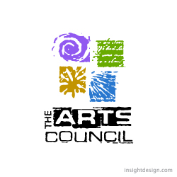
The Arts Council logo depicts four modes of artistic expression all hand drawn
Location:
Logo design Wichita, KS
Style:
Illustrative logo design
Industry:
Arts logo design
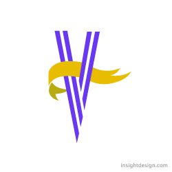
Victory in the Valley is a non-profit organizati
Location:
Logo design Wichita
Style:
Initial logo design
Industry: